Lorem ipsum dolor sit amet.
Lorem ipsum dolor sit amet, consectetur adipisicing elit, sed do eiusmod tempor incididunt ut labore et dolore magna aliqua.
<div class="myclass">...</div>qinsidea q element
Badge 1 Success 4 Warning 3 Danger 4
Lorem ipsum dolor.
Someone famous
| Table | Heading |
|---|---|
| Table | Data |
| Table | Data |
Lorem ipsum dolor sit amet, consectetur adipisicing elit, sed do eiusmod tempor incididunt ut labore et dolore magna aliqua. Ut enim ad minim veniam, quis nostrud exercitation ullamco laboris nisi ut aliquip ex ea commodo consequat. Duis aute irure dolor in reprehenderit in voluptate velit esse cillum dolore eu fugiat nulla pariatur. Excepteur sint occaecat cupidatat non proident, sunt in culpa qui officia deserunt mollit anim id est laborum.
Currently available widgets


Use a shortcode to display your widget anywhere on your website
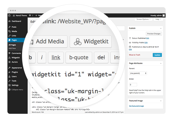
To get started, click on the Widgetkit button in your CMS edit view. Now choose the widget you would like to render, for example Grid. To create content for your widget, hit the New button and select the content type, for example media.
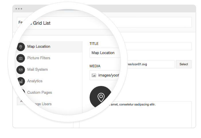
To create your content, you can add single content items by using Add Item. Alternatively you can use Add Media to select multiple items at once through the media library or manager of your CMS. Don’t forget to hit Save after you have created your items and then Close.
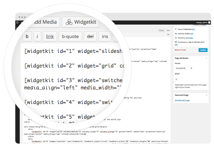
To finalize your widget, hit Insert. Now you will see a shortcode with the ID and settings of your widget. If you have changed the default settings of your widget, the updated settings will be added to the shortcode. To select a different widget, click inside the shortcode and hit the Widgetkit button. Now click Change Widget.
All widgets make use of modern web technologies
6 different theme styles for a good start.
We provide lovingly crafted style variations to give you a glimpse of what is possible with this theme. The built-in theme customizer allows you to modify colors, fonts, sizes and much more without any CSS knowledge. Just choose your colors with the color picker and adjust the theme with only a few clicks. Click on one of the images to see the style.
JOY Theme allows you to display the site's wrapper with small, medium, large as well as full width. These options can be selected in the Warp administration.


This theme comes with three different navigation layouts and some additional options. The main menu can be centered or aligned to the left or right.
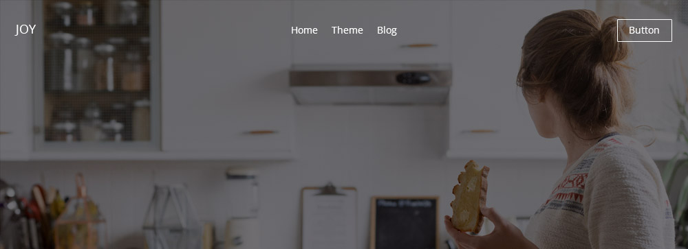
You can place the menu on top of the content and it will automatically turn transparent. The navigation can also be inverted for better display. If the navigation is fixed, it will maintain its default color.

Of course this theme provides the option to apply a sticky navigation. When scrolling the page it will remain at the top of the browser window.
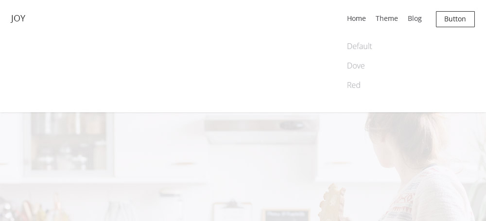
Another option allows you extend the main navigation dropdown to the width of the entire browser window. A subtle overlay will be applied to the rest of the site while the dropdown is open.
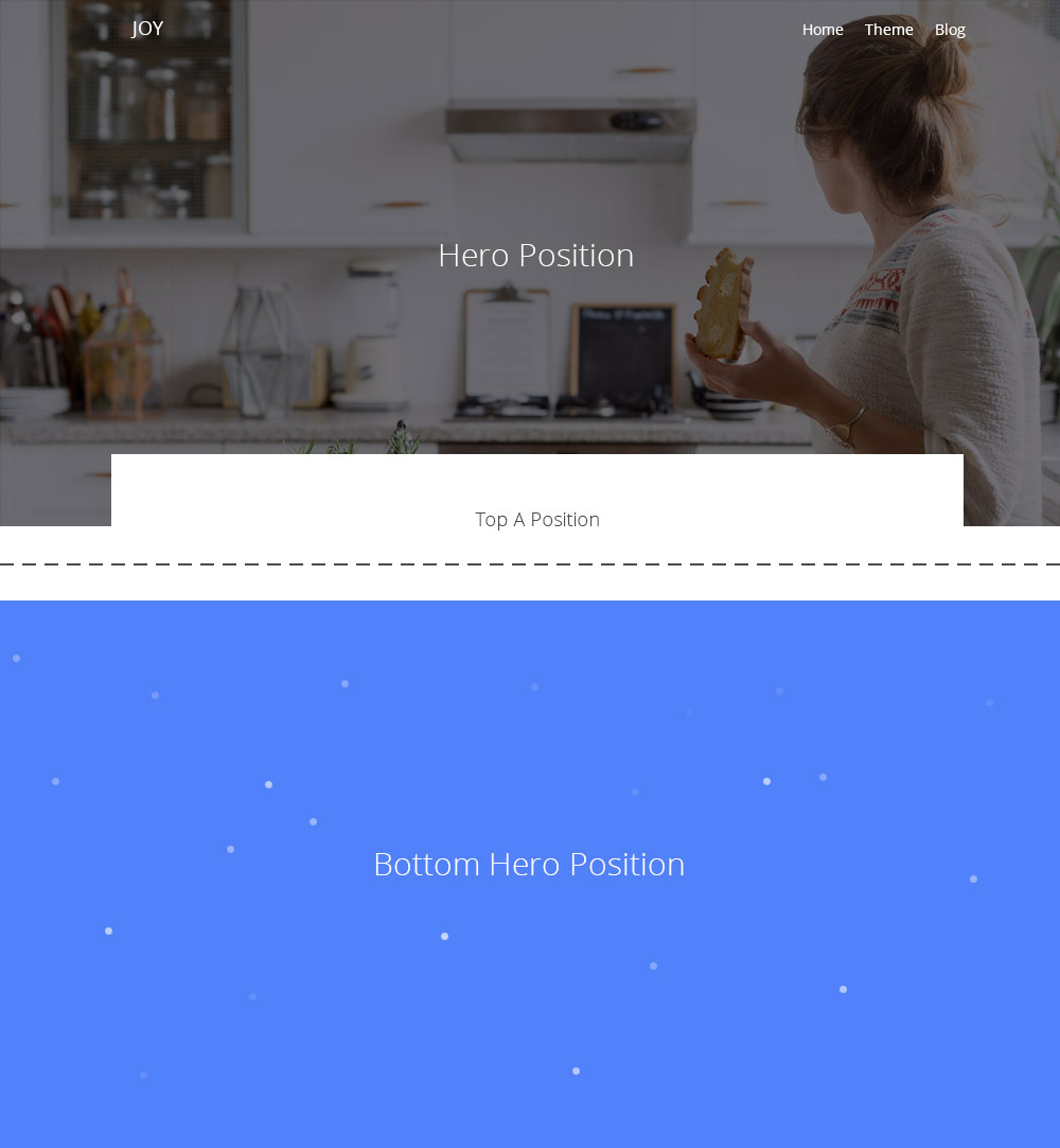
The additional Hero positions at the top and bottom of the theme feature a number of custom settings.
You can enter a background image path or color value (RGBA or Hex) for each hero position.
Enabling this option will add an animation to the you background color, rotating it through a spectrum of automatically generated hues.
Add your own color value (RGBA or Hex) to the particles animation.
Enabling this option will add an animation similar to snow falling upwards.
You can add custom classes here and they will be applied to the block. For example, add the .tm-top-hero-gradient class to the top-hero section to fade it out towards the bottom.
To give you more flexibility, JOY theme provides a number of settings for each module position. You can apply different background colors, paddings, content widths and place a divider between blocks.

Muted, Default, Primary, Secondary

Full, Default, Small

None, Small, Default, Large

Checkbox (true or false)
The custom Slideshow widget features a display announcing the number of items as well as the active item.
The conjoint slidenav can be positioned to the top left, top right, bottom left or bottom right of the Slideshow.
The custom Slideshow Panel widget features the same additions as the Slideshow, i.e. the numeration and special slidenav.
JOY theme comes with a fancy typewriter effect for headings. Just add the data-tw attribute to a text element and the letters of each word will be displayed successively.
Enjoy your Life
By default, the letters just pop in. But you can use any of the classes of the Animation component from UIkit to apply an effect, like a fade or scale.
<p data-tw="{cls: 'uk-animation-scale-down'}">...</p>
To adjust the speed of the letters coming in, add the data-tw="{cls: speed: 1}" attribute. The higher the numeric value, the slower the animation will progress.
Run, Forrest!
data-tw="{speed: 1}"
Hakuna Matata
data-tw="{speed: 200}"

JOY theme comes with an optional alternative blog layout. The default blog layout is also still available.
| Class | Description |
|---|---|
.tm-title-large |
Add this class to a text element to apply the heading's font family and to increase the font size. |
.tm-text-color-1
|
These classes apply different colors to text elements, for example to emphasize a <span> element. |
.tm-top-hero-gradient |
This class will apply a gradient fading out the bottom of the Top Hero position. Go to Templates > yoo_joy > Options > Layouts. Scroll down to Hero Blocks and type it in the class field of the top-hero section. |
.tm-title-dash |
Add this class to a heading to indent the text and add a dash in front. |
.tm-subnav-line |
Add this class to a Subnav element to add dashes between nav items. |
.tm-title |
This class applies a custom styling to headings, adding a bottom border as a sort of separator. Page titles are automatically given the same style in Joomla. |
.tm-button-link |
Add this class to a button or anchor to indent its text and add a dash in front. |
.tm-shadow |
Add this class to an element to apply a box shadow to it. |
.tm-margin-large-top |
This class applies an additional 100px space to the top of an element on medium or large viewports. |
.tm-margin-large-bottom |
This class applies an additional 100px space to the bottom of an element on medium or large viewports. |
.tm-icon-google-plus
|
These classes apply the appropriate corporate color to each social icon button. |
This theme is available for Joomla and
WordPress including the same features on each system.
Lorem ipsum dolor sit amet, consectetur adipiscing elit, sed do eiusmod tempor incididunt ut labore et dolore magna aliqua. Ut enim ad minim veniam, quis nostrud.
124 Harbor Avenue, Hamburg 1-234-457-89
Esta dirección de correo electrónico está siendo protegida contra los robots de spam. Necesita tener JavaScript habilitado para poder verlo.
Author
May 2, 2090 at 1:55 pm
Lorem ipsum dolor sit amet, consetetur sadipscing elitr, sed diam nonumy eirmod tempor invidunt ut labore et dolore magna.